 |
| Frank; oil on canvas, 26" x 26" (Tina) |
Tina says that it is not quite finished and asked me to post it under 'works in progress'. It's there too, but I thought it should also be highlighted in a post of its own.
|
| Frank; oil on canvas, 26" x 26" (Tina) |


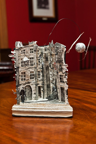 |
| the stories are in the stones.. |
 |
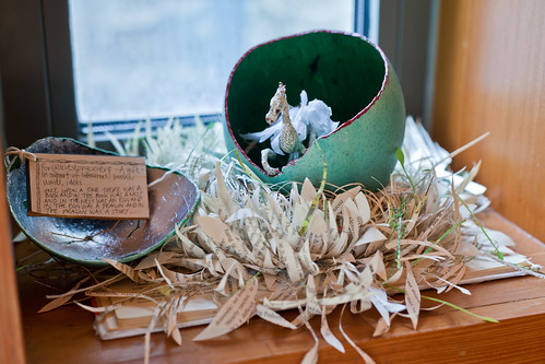
| the poetree |
 |
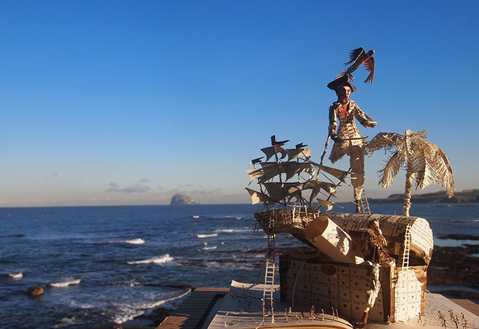
| once upon a time there was a book... |
 | ||
| because reading matters... |

 |
| flowers, positive |
 | ||||||||
| flowers, negative |
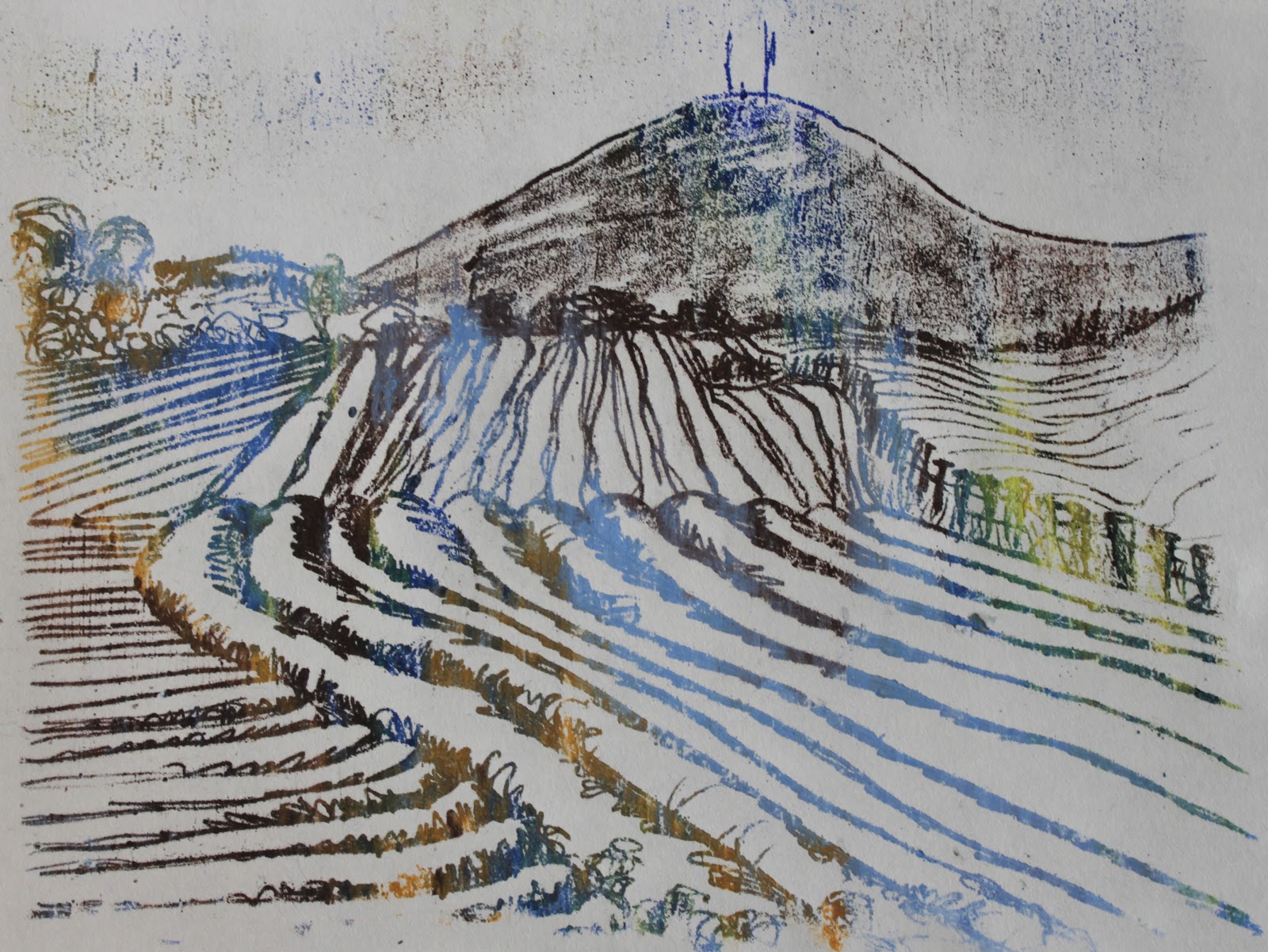 |
| landscape, positive |
 |
| landscape, negative |