Showing posts with label sketchbook. Show all posts

Sunday, 10 August 2014

Exhibition in Shropshire

Fiona has had a painting accepted for the Whittingham Riddell National Fine Art Open exhibition at Weston Park in Shropshire, showing from 6th August until 27th August.

The painting started as always in a sketchbook; one of a series of quick colour studies of the sky at sunset, looking west over the Irish sea from Aberaeron during the longest days of the year in June. It was then developed from the sketchbook studies, in acrylics and oils on canvas.

 
'rock melt west'; acrylics, oils on canvas


floating frame

on display at the exhibition

one of the sketchbook studies


Tuesday, 24 September 2013

Garden shed

garden shed from Fiona's garden; inks and watercolour (Jane)
Broken-down garden sheds are a bit of a speciality in Wolverhampton. As they sag and lose planks, people prop them up and patch up the holes. Black Country people are endlessly resiliant and resourceful. Makeshift blue vinyl rooves are a common sight and almost a work of art in themselves.  These temporary structures become permanent fixtures amidst the nettle patches and compost heaps at the end of the garden.

Jane was taken by this particular shed, and came round to sketch it before we put up another in front of it (in order to decant the contents of our broken-down shed so that we can patch it up in turn, so the cycle continues..). In the spontaneity of her brushstrokes and the discrete use of the startling blue, she has captured the wildness of the undergrowth, and the dappled light as it filters through the tall trees, as well as the unique character of the garden shed.

Saturday, 21 September 2013

Sketching in Tuscany


We had a wonderful and inspirational week in Tuscany. Our trip started in Pisa, the air fresh and clear after overnight electric storms. The view from our hotel was spectacular. We sketched for an hour before journeying to Volterra for the workshop.


Leaning Tower, Pisa; pencil (Tina)

duomo, Pisa; watercolour, conte crayon and ink on altered book (Fiona)

In Volterra, we were greeted with a gentle and warm-hearted welcome by Klaudia, Wolfgang and Anton to the Villa Guadelupe, and over the next few days formed a firm bond with the group of diverse, talented and committed artists who had travelled from all parts of Italy, and from Spain, Germany and Russia, to take part in the workshop. The hospitality was fabulous. Simo and Caroline were supportive and energetic workshop leaders, taking us from sketching inside the villa, looking outwards to the gardens and hills beyond; then back to the ancient history of the area, sketching in the Etruscan museum and the Roman amphitheatre and the streets of Volterra; ending with a sketchcrawl to the final public exhibition of our collective work on the final day. Simo has written a summary of the workshop in english here  and in italian on her blog here.


We finished the trip off with a day in Florence. The warmth of the landscape and the people and all that we'd learned made us want to stay longer; a sign of a great week. Photos of the workshop and participants here

A few examples of our sketches:
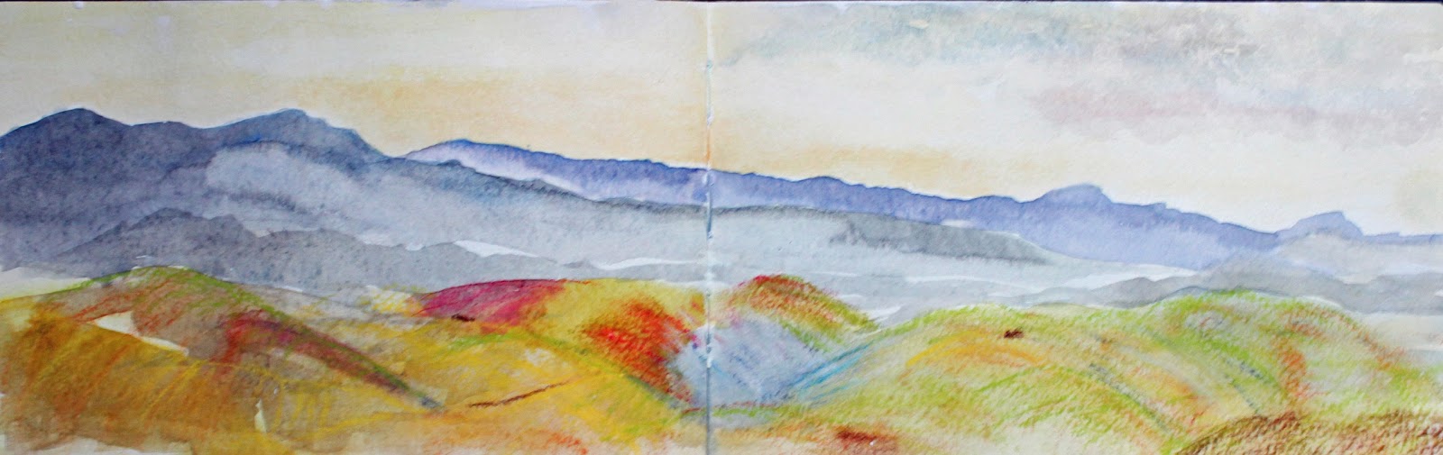
Val di Cecina from Villa Guadelupe, Volterra; watercolour & conte crayon (Fiona)

Val di Cecina from Villa Guadelupe, Volterra; watercolour (Tina)
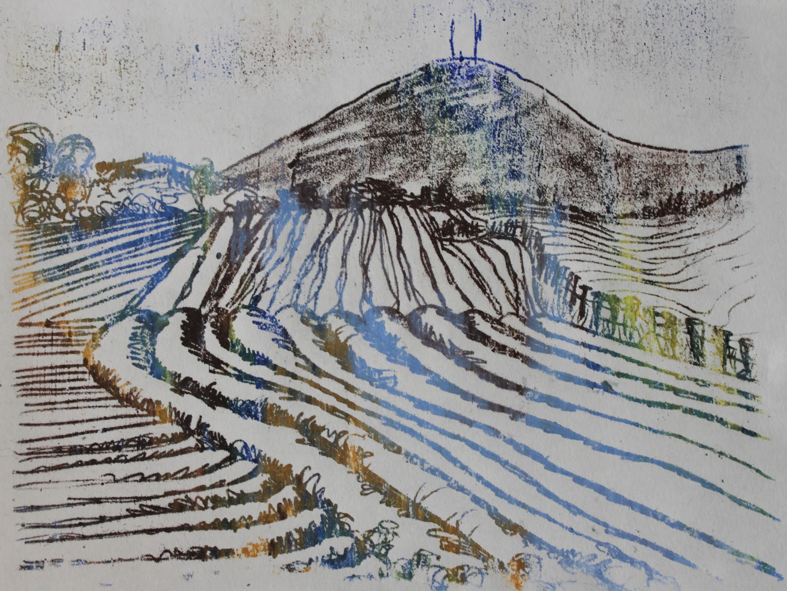
Olive groves and the Val di Cecina; indian ink (Fiona)


Volterra garden; watercolour (Tina)

Etruscan bronze statuettes; inktense pencil (Fiona)

Florence, from Santa Croce; ink & watercolour (Tina)


Sunday, 25 August 2013

Seeing the world one drawing at a time

Two of us (Fiona and Tina) are flying to Italy next week to take part in 'Tuscan Landscape', an urban sketchers' workshop in the ancient city of Volterra, based in the beautiful Villa Le Guadalupe.


We will be sketching and seeing our surroundings 'one drawing at a time' in keeping with the urban sketchers' manifesto (see below). Their philosophy of truth in looking, capturing and sharing is one that chimes resoundingly with all us who sketch and paint. We'll also be sketching the magnificent Etruscan and Roman remains, working expressively and experimentally exploring interrupted lines and fragments.  We're very much looking forward to sketching in such a wonderful environment and meeting the interesting people who are also attending. In fact we're so excited to be going, and to be going together, that we've been quietly delirious for weeks.

I attended a similar workshop in 2011 and wrote about it in my personal blog here and here.

USK Manifesto

1. We draw on location, indoors or out, capturing what we see from direct observation. 2. Our drawings tell the story of our surroundings, the places we live and where we travel. 3. Our drawings are a record of time and place. 4. We are truthful to the scenes we witness. 5. We use any kind of media and cherish our individual styles. 6. We support each other and draw together. 7. We share our drawings online. 8. We show the world, one drawing at a time.

Reading this manifesto earlier this summer, I was spurred on to sketch even more regularly. I've therefore had a very pleasant summer sitting outside cafes and in pub gardens, consuming excellent coffees, beer and various cakes, pies etc, sketching whatever I could see in front of me. I made my own sketchbook, taking an old poetry textbook and altering the pages by staining them with inks, household emulsion and gesso or including extra pages, mostly old monoprints, textured papers etc. Every page is different and the challenge has been to work on whatever surface presents itself next, no matter the subject, and no matter how difficult! I'll post about how I made the book in another post later. 

All sketches have been done on location; on some of the pages, colour and texture has been added later. Here are a few examples:


Victorian pub 'the Rising Sun'; watercolour, ink and gouache on yellow household emulsion paint (Fiona)

16thc coaching inn 'The Crown'; gouache and inks on ink-spattered text (Fiona)

fields and sky at Compton Verney; watercolour and gesso (Fiona)

stone sculpures at Tong church; inks on old monoprint (Fiona)

Tong church and village; watercolour, inks and white marker pen on household emulsion (Fiona)

light and dark; inks, crayon and gouache on household emulsion (Fiona)

watercolour, gouache and inks on old monoprint (Fiona)

Saturday, 24 August 2013

summer sketchbooks 3

Sue came back from St. Ives with sketches on watercolour paper, sketches on postcards, a moleskine watercolour sketchbook (almost full!) and also a number of life-drawings from an evening at the St.Ives School of Painting. Truly spectacular output, not just in quantity but also in the quality of the paintings, each one a watercolour gem, demonstrating her usual lightness of touch and sensitivity in choice of subject and composition

Here are a few of her colour studies, again all worked on location en plein air:


Saturday, 17 August 2013

summer sketchbooks 2

Sue came back from St. Ives with sketchbooks filled with ink and watercolour studies. Her love for the town and surroundings began when she first went there on holiday as a teenager. Her sketches show great sensitivity of touch and deep affection for the landscape. All her sketchbook work is done from direct observation en plein air.

Here are some of her pen and ink drawings of boats in the harbour:


Tuesday, 30 July 2013

summer sketchbooks


Some extracts from summer sketchbooks, with more to follow over the next few weeks...

An ever-stretching wild river meadow of dandelions with fields of yellow oil-seed rape beyond, sweltering in the golden light of mid-summer, the river deep and fast behind me.
This was worked up from an in-situ sketch as preparatory work for a painting on canvas. I've started to work in a bigger format (A3 sketchbook) in an attempt to ease the transition from living in my sketchbook to stand-alone work.

Severn valley, Shropshire; 82cm x 30cm; inks, watercolour & enamels on gesso (Fiona)
This sunflower sketch was an experiment in using Ecoline watercolour inks. I bought a set a few years ago and have never really got to grips with them, mainly because I'm used to making a limited palette work hard, and tend to avoid brilliant colours.  However, the vibrancy of these inks really comes into its own using pen and wash. The subsequent Indian ink washes and cool conte crayon  work as a counter-balance.

sunflower; 30cm x 41cm; inks & conte crayon (Fiona)


bleached treetrunk, Himley Hall; 30cm x 41cm; inks, aquarelle & conte crayon (Fiona)
I sketched this old dead tree trunk in the teeth of a very brisk north wind, so worked quickly with a broad bamboo pen and various inks, flinging it all around in order to complete the entire sketch in about 15 minutes. That way I could get back quickly into the warm sunshine... but also a great way to free up a drawing and work expressively.


Sunday, 20 January 2013

drawing as stitch

 
Here are some stitched drawings by Tina. Two are based on everyday scenes observed in her local market. The other was sketched (as a passenger!) on a long car journey.

Tina likes to use a continuous line in some of her drawings. By keeping the pencil on the paper, the line becomes free and the relationship between the subject and the observer are somehow brought intimately together. The line connects elements in the composition, relates disparate and similar subjects, sometimes identifying and repeating patterns, other times contrasting shapes and textures, always drawing the eye round the canvas, exploring how objects relate to one another both in the drawing and in the life Tina observes so beautifully around her.

This is a technique which crosses so-called artistic boundaries, and lends itself perfectly to interpretation through stitch. These drawings have all been resolved through the medium of a sewing machine and plain black thread on cotton.

fish stall, market; black thread on cotton (Tina)
egg stall, market; black thread on cotton (Tina)

a long drive; black thread on cotton (Tina)

Tuesday, 1 January 2013

daily practice

I'm not sure if we at 'drawing allowed' have any new year resolutions other than to continue to make time for our own creative practice and to share it with others.

Before the holidays I decided to make time to follow Chris Carter's online drawing exercises. Chris is a very experienced and talented artist who has a strong and generous commitment to sharing her skills and experience through her blogs. She posts three times a week with quick tasks, always with an explanation of what to do and why it's important.

For example: Her first exercise is about getting into the habit of sketching for 5 minutes every day. It doesn't sound a lot, but we all know how hard that is sometimes. But if you follow her advice you'll find yourself doing 5 minute sketches wherever you are whatever your circumstances, and all without even thinking about it. Before you know it, you'll  have a sketchbook full of sketches, inspiration and ideas for further development.

Find Chris's exercises here.

I hope you find them as useful as I have.

A prosperous and creative New Year to all. And for our italian followers.. auguri e tante belle cose per l'anno nuovo.


Monday, 10 December 2012

drawing as printing (2)


Following on from a previous post, 'drawing as printing', I said I would return to the topic to describe the materials and process with pictures.
 
Materials:

-2 pieces of cartridge or drawing paper. I cut mine to approx 8" x 8".
-soft pastels or chalk in pale shades
-oil pastels
-drawing tools e.g. ball-point pen, hard pencil, chopstick, stick, the wrong end of a brush.. experiment with mark-making using different tools.


 1) using soft pastels, cover one of your pieces of paper entirely with colour. It doesn't matter which colours you choose.


2) choose some oil pastels and steadily rub them on top of the soft pastel surface until the whole surface is covered. A fairly generous hand is required. Irregular shapes will be most effective, the more random the better. Overlap the colours to soften transitions and mix colours on the paper. Here I've chosen 5 colours: dark blue, pale blue, lemon, ochre and a mid-green.


3) On a flat surface, take your coloured paper and place it face-down onto a clean piece of paper.

4) At this stage you can either take some time to experiment with different drawing tools or choose a subject/pattern and plunge right in. 


5) Taking a page from my sketchbook as inspiration, I choose to draw the shell on the right.


6) Working into the back of my coloured paper, I use a ball-point pen to do a simple outline drawing of the shell based on the sketchbook image. A firm line and simplified form works best. Here I've varied the weight of the line slightly to emphasise the basic shape.


7) Happy with the drawing, now I'm ready to see what's been happening underneath. I peel back the paper to reveal an oil pastel monoprint. You can see how the random colour placement magically gives form and interest to a fairly ordinary outline drawing.


 The negative image is also interesting....


...but if you don't want to keep it, then you can continue using the coloured 'plate' until exhausted.


Here's another monoprint taken from the same coloured plate, this time of dried honesty seedheads. The drawn lines as less distinct in places but the image still works.


The negative image is now breaking up, but could make a very interesting texture to work into as it is, or to cut up and use as collage, or to paint over... wherever your creativity takes you. Never throw anything away!


If you experiment with this technique we'd love to see your work. Post a pic on your own blog and leave a comment here with the link. We'll drop by and visit.


Sunday, 2 December 2012

drawing as printing

Before I post some more catching-up with our sketching so far year, I've been asked about the drawing in the background of the blog.

It is a quick outline sketch by Tina (whilst chatting!) of some roses and chrysanthemums. The mark-making is soft and expressive and moves smoothly through different blues and greens. The result is beautifully fresh and spontaneous.


The drawing is worked by pressing a drawn line (with a pencil, chopstick, biro, stick...) firmly onto the wrong side of a paper preprepared on the other side with chalk pastel and oil crayon, then placed face-down on a clean piece of paper on which the image appears (it's simpler to do than it sounds), creating a kind of dry monoprint. The oil pastel lifts from the chalk/soft patel ground and transfers to the clean piece of paper. It's a very satisfying technique and always fun to do whether you're a beginner or more experienced, with the added dimension of surprise.. you are never quite sure how it's going to turn out. It also has the added bonus of producing both a positive and a negative image.


flowers, positive
flowers, negative


The drawings can stand alone as they are, can be used as a basis for further work in oils, or can be developed with other media; for example, with watercolour washes the oil pastel acts as a resist. 

If you're not confident about drawing as Tina did directly from a subject, then you can also use this technique with photographs or tracings to excellent effect.

Here's a different subject by Fiona this time, based on plein air sketchbook work of a ploughed field, drawn here using a biro through a soft pastel and oil pastel 'plate' as above.


landscape, positive
landscape, negative

I'll post a 'how to' with details of materials and photos of the process later this week.


Related Posts Plugin for WordPress, Blogger...