Showing posts with label printmaking. Show all posts

Friday, 19 September 2014

Printmaking: Farmer's Bridge Locks, Birmingham

Farmer's Bridge Locks; 2 block relief print on paper , 11cm x 11cm (Fiona)
Farmer's Bridge no longer carries farmers to market, but lends its name to a flight of 13 locks on the Birmingham and Fazeley Canal in the centre of Birmingham. At this point the canal travels through the undercrofts of deserted red-brick warehouses, flat conversions and modern office blocks. Birmingham is a city permanently in flux, constantly reinventing itself; the city-centre streets full of high-viz jackets and hard hats; the skyline punctuated by cranes and pile-drivers.

I live in a nearby city and walk regularly along the many miles of canal in the area, sketchbook to hand; urban and rural, always interesting. When we realised we were going to be living here for some time, we managed to buy a share of a narrowboat, so also spend time each year on the water, seeing the world at a very slow pace from a constantly refreshing vantage point.

block 1 (grey)

block 2 (black)

Fiona worked this image from one of her pencil sketches, then simplified and carved the image into two vinyl blocks.

This print has been accepted for an open exhibition (10th - 20th September) in Birmingham at the RBSA.

Monday, 10 December 2012

drawing as printing (2)


Following on from a previous post, 'drawing as printing', I said I would return to the topic to describe the materials and process with pictures.
 
Materials:

-2 pieces of cartridge or drawing paper. I cut mine to approx 8" x 8".
-soft pastels or chalk in pale shades
-oil pastels
-drawing tools e.g. ball-point pen, hard pencil, chopstick, stick, the wrong end of a brush.. experiment with mark-making using different tools.


 1) using soft pastels, cover one of your pieces of paper entirely with colour. It doesn't matter which colours you choose.


2) choose some oil pastels and steadily rub them on top of the soft pastel surface until the whole surface is covered. A fairly generous hand is required. Irregular shapes will be most effective, the more random the better. Overlap the colours to soften transitions and mix colours on the paper. Here I've chosen 5 colours: dark blue, pale blue, lemon, ochre and a mid-green.


3) On a flat surface, take your coloured paper and place it face-down onto a clean piece of paper.

4) At this stage you can either take some time to experiment with different drawing tools or choose a subject/pattern and plunge right in. 


5) Taking a page from my sketchbook as inspiration, I choose to draw the shell on the right.


6) Working into the back of my coloured paper, I use a ball-point pen to do a simple outline drawing of the shell based on the sketchbook image. A firm line and simplified form works best. Here I've varied the weight of the line slightly to emphasise the basic shape.


7) Happy with the drawing, now I'm ready to see what's been happening underneath. I peel back the paper to reveal an oil pastel monoprint. You can see how the random colour placement magically gives form and interest to a fairly ordinary outline drawing.


 The negative image is also interesting....


...but if you don't want to keep it, then you can continue using the coloured 'plate' until exhausted.


Here's another monoprint taken from the same coloured plate, this time of dried honesty seedheads. The drawn lines as less distinct in places but the image still works.


The negative image is now breaking up, but could make a very interesting texture to work into as it is, or to cut up and use as collage, or to paint over... wherever your creativity takes you. Never throw anything away!


If you experiment with this technique we'd love to see your work. Post a pic on your own blog and leave a comment here with the link. We'll drop by and visit.


Sunday, 2 December 2012

drawing as printing

Before I post some more catching-up with our sketching so far year, I've been asked about the drawing in the background of the blog.

It is a quick outline sketch by Tina (whilst chatting!) of some roses and chrysanthemums. The mark-making is soft and expressive and moves smoothly through different blues and greens. The result is beautifully fresh and spontaneous.


The drawing is worked by pressing a drawn line (with a pencil, chopstick, biro, stick...) firmly onto the wrong side of a paper preprepared on the other side with chalk pastel and oil crayon, then placed face-down on a clean piece of paper on which the image appears (it's simpler to do than it sounds), creating a kind of dry monoprint. The oil pastel lifts from the chalk/soft patel ground and transfers to the clean piece of paper. It's a very satisfying technique and always fun to do whether you're a beginner or more experienced, with the added dimension of surprise.. you are never quite sure how it's going to turn out. It also has the added bonus of producing both a positive and a negative image.


flowers, positive
flowers, negative


The drawings can stand alone as they are, can be used as a basis for further work in oils, or can be developed with other media; for example, with watercolour washes the oil pastel acts as a resist. 

If you're not confident about drawing as Tina did directly from a subject, then you can also use this technique with photographs or tracings to excellent effect.

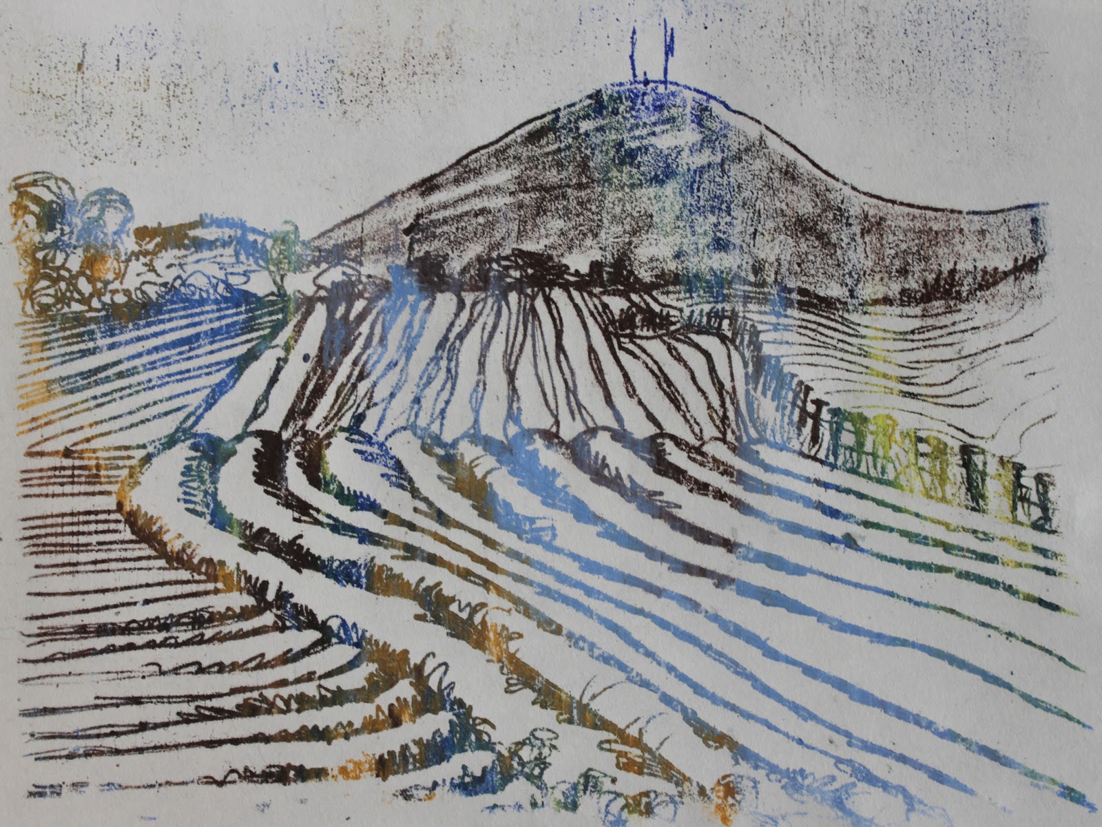
Here's a different subject by Fiona this time, based on plein air sketchbook work of a ploughed field, drawn here using a biro through a soft pastel and oil pastel 'plate' as above.


landscape, positive
landscape, negative

I'll post a 'how to' with details of materials and photos of the process later this week.


Related Posts Plugin for WordPress, Blogger...